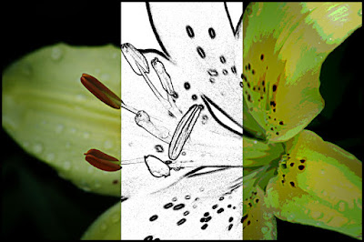
 How an image is presented is a big deal when it comes to a recording of a scene or art. As has been talked about on the blog before, intent is the key to figuring out how an image should be displayed. In today’s image we see three different representations of what could be done to distinguish the shot. On the far left we have pretty much the straight shot. The only things that have been done are sharpening and applying a vignette. Would the image be anything special if left natural? No! It’s a shot of a flower with the seeds in focus and the back pedal going a little soft. Not a big deal. The center shows the image as a graphic, a line drawing type of treatment. This can be used to study an image, to pick it apart to determine what’s important and what can be diminished. There’s an application for this type of image. It could be used by a botanist to describe the markings on the pedals or study the shape of the seeds. If many flowers were treated in this manner, someone with the proper background might be able to discern problems in one batch over another. There could be a problem at the farm or nursery a specific number of specimens came from. It could help the grower track down what is going on at his/her facility that causes illnesses in the flowers. The center portion of the image could be used for analytical purposes. The right hand section of the image is another type of graphic representation of the original image. The might be used as a study by a muralist. Murals aren’t typically painted as continuous tone objects. Murals are meant to be viewed at a distance, especially those found outside, spanning multiple stories of a building. For the painter to even attempt continuous tones would make him/her crazy. Once an artist breaks down the image to a manageable number of colors, the job of creating the larger than life image becomes relatively easy. There are several ways to break down images for specific purposes. Being able to do the break down for clients is an art. Understanding the needs determines the amount of “art” that needs to be included in an image. To review the two techniques (center and right) used to produce today’s overall image, hit the “read more”.
The easiest method (that I know of) to get the center image would be to use the Filters/Stylize/ Find Edges filter, convert the result to B&W and use a Levels Adjustment Layer to bring the whites up and the blacks down. This control is the key to this type of structure.
The right portion of the shot can be accomplished in several ways. The easiest is a simple posterization (Filter/Artistic/Poster Edges). Pick a low number of posterization steps. Once you get to eight or above the crispness of the colors starts to go more toward continuous tone. Standing with four, five or six steps is good for “most” images.
The key is to work with the client to determine their needs. What they will doing with the alteration of the straight shot is key to what “effect” to give.


0 comments:
Post a Comment