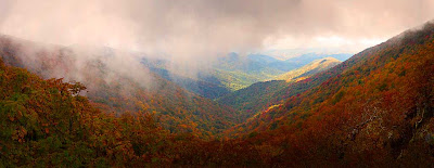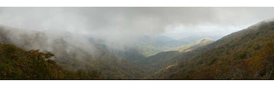
 Overnight I was trying to think of another way to demonstrate the power of one of Photoshop CS5’s most talked about new features. You may have seen it demonstrated at a Photoshop World video out on Youtube. I think I’ve come up with a different way to show just how powerful a tool is coming our way. Take a look at today’s dual images. They’re both the same panorama, shot on the Blue Ridge Parkway in North Carolina or southern Virginia. I did some finishing on the top image, boosting the color saturation of each color (Red, Yellow, Green, Cyan, Blue, and Magenta), but that’s not the story here today. Look at the vertical size of each image. Which one makes the more dramatic pano is a matter of taste, but the freedom to use more of your shots is amazing. Are the two images representative of the “same” panorama? As close as possible. I took the thinner image (we’ll refer to it as “image one”) and copied it over onto the thicker image (“image two”). I did the initial alignment by lowering the Opacity of image one to about 45% and, using the Move Tool (V), matched up the sunlit hill just right of center in the background. Then I inversed the colors of image one (CTRL I) and changed the Blend Mode to Difference. That way, whenever pixels matched, the result was black. Next I used Free Transform (CTRL T) to nudge image one into an overlapping scale of image two. Are they matched? I’d said about 98%. There were a few cracks of light showing through the black, but it was darn close. Image one was the best that could be gotten using Photoshop CS4. The Crop (C) was at the absolute top and bottom of what could be cut out of the blended panorama. In fact, I’ve been known to squeeze a sliver of empty space into the image and use the Clone Stamp Tool (S) to fudge in the very top and bottom. Here’s a “real world” example of what Adobe has in store for us with CS5. I don’t think “rocket scientists” or “brain surgeons” have anything over the folks at Adobe. They keep doing hard to believe stuff. To find out more about the details of this matchup, hit the “read more”.
“Image one” was made shortly after we got back from a vacation drive to Tennessee in 2007. “Image two” was done yesterday. Image one was never “finished” with the colors saturated, sharpened, and a vignette applied. Image two was, and also had a Warming Filter (85) Adjustment Layer applied. But, again, that’s not the crux of today’s post. One “dirty little secret” about image two is that about 10% of the vertical size was cut off to position the far horizon more favorably. So, there was even more useable image than shown.
You can see that the bottom “V” formed by the two closest hills is cut off just a bit in image one. CS5 figured out what was going on and completed the bottom of the “V”, including the overlap of the hills. Over on the left hand side the foreground bushes have a lot of detail in the leaves. Rather than filling the area with a fuzzball of colors with no form, you can see that the leaf patterns were filled in with amazing detail.
All I have to say is “incredible”. I’m blown away using the newest features coming in CS5.


0 comments:
Post a Comment